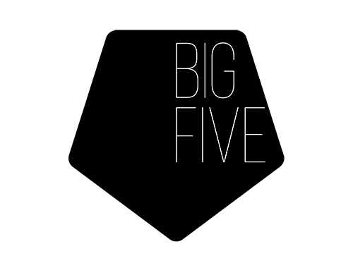
This young and innovative realestate agency wants to bridge the gap between Europe and Tanzania. By providing western buyers with reliable service and quality products Big Five Realestate hopes to do just this.
The name "Big Five" derives from the colloquial term for the most challenging game in Africa: the wilderbeast, the leopard, the rihno, the elephant and the lion. Though the agency obviously does not condone hunting these beautiful animals for any reason, the name itself is synonymus with the rich wildlife and culture of this great continent.
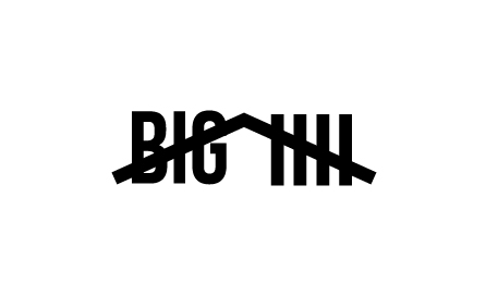
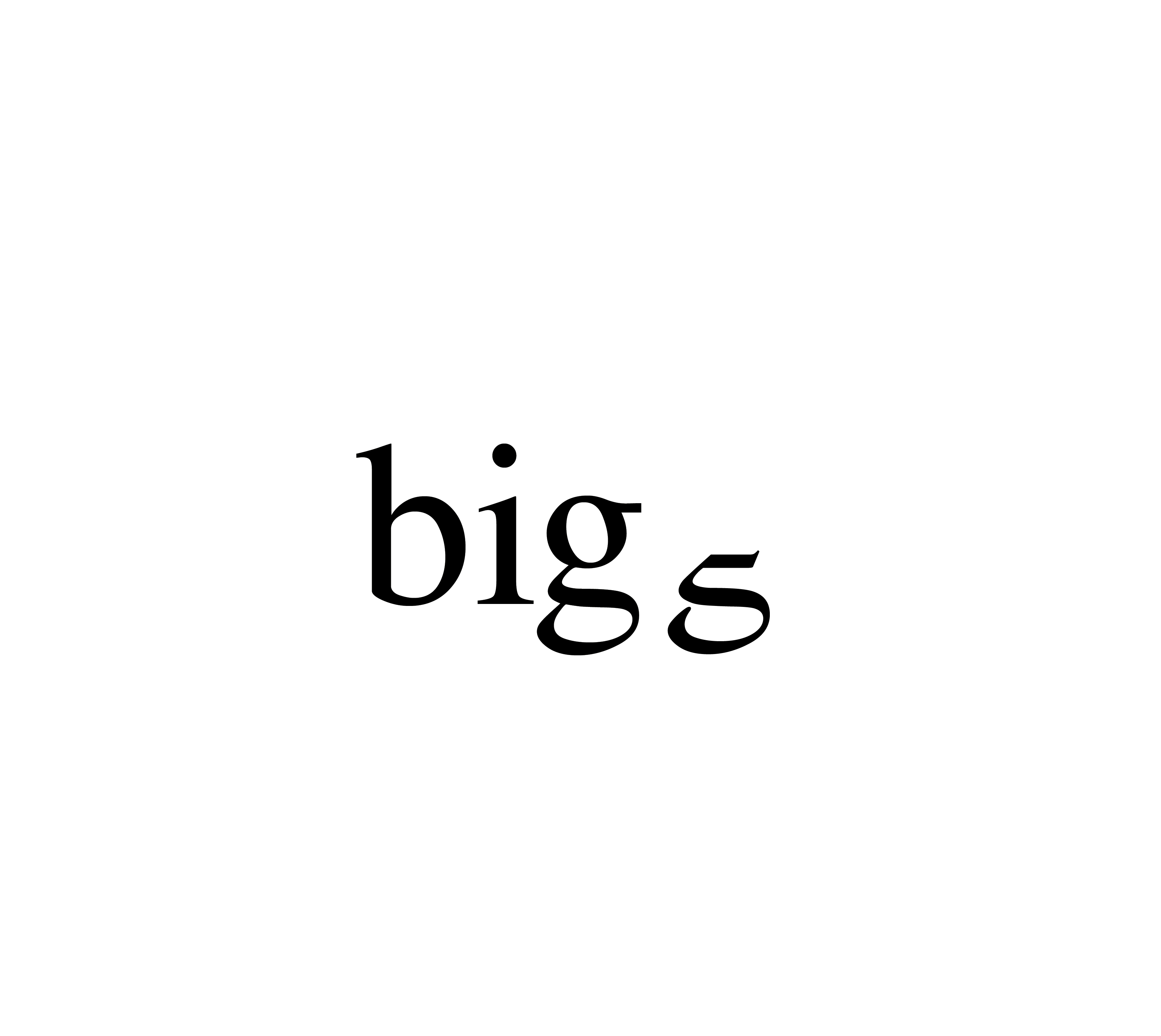
At first the idea was to present all of the animals in one logo through the use of negative space. However the realisation that this did not represent the realestate or architectural quality of the company became clear rather quickly. So the focus switched to a more convetional logo, relying on the words to do the work.
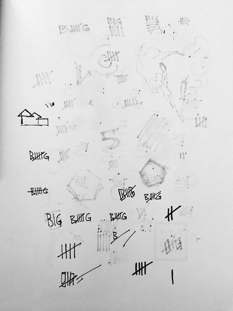
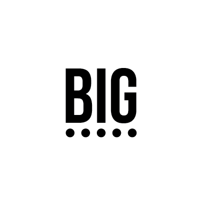
The idea that seemed the most intruiging was the familiar five dashes used to represent the number five. Often seen in pop culture as counted points or time.
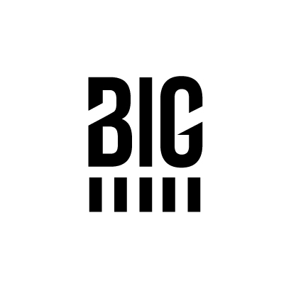

Unfortunately those concepts did also not adress the realestate side of the realestate agency. So the focus shifted to a cleaner design language in hopes to replicate a sense of architecture.
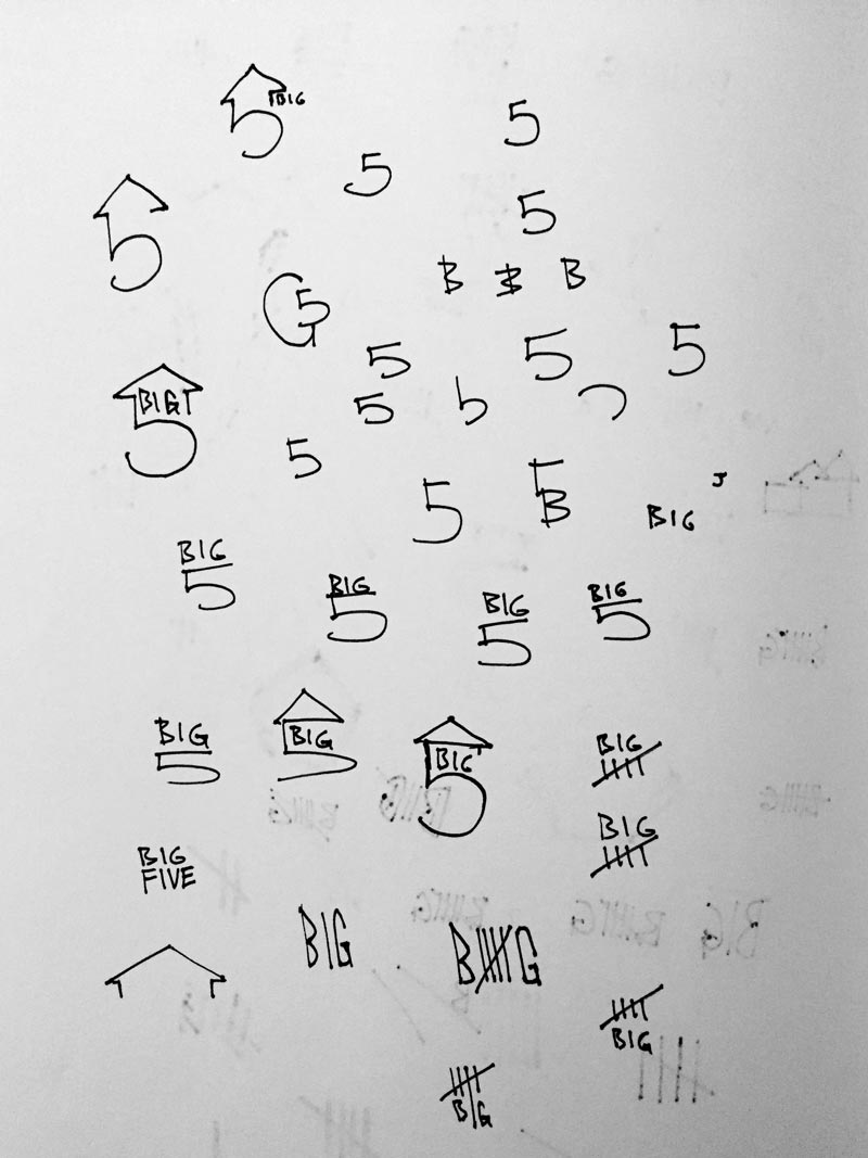
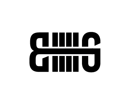
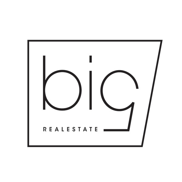
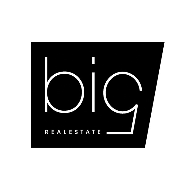
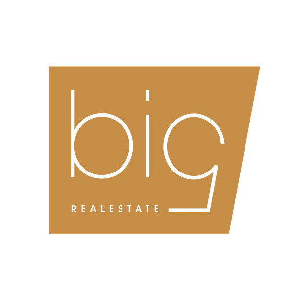
The attempt was made to turn a double-story lowercase 'g' into the number five.
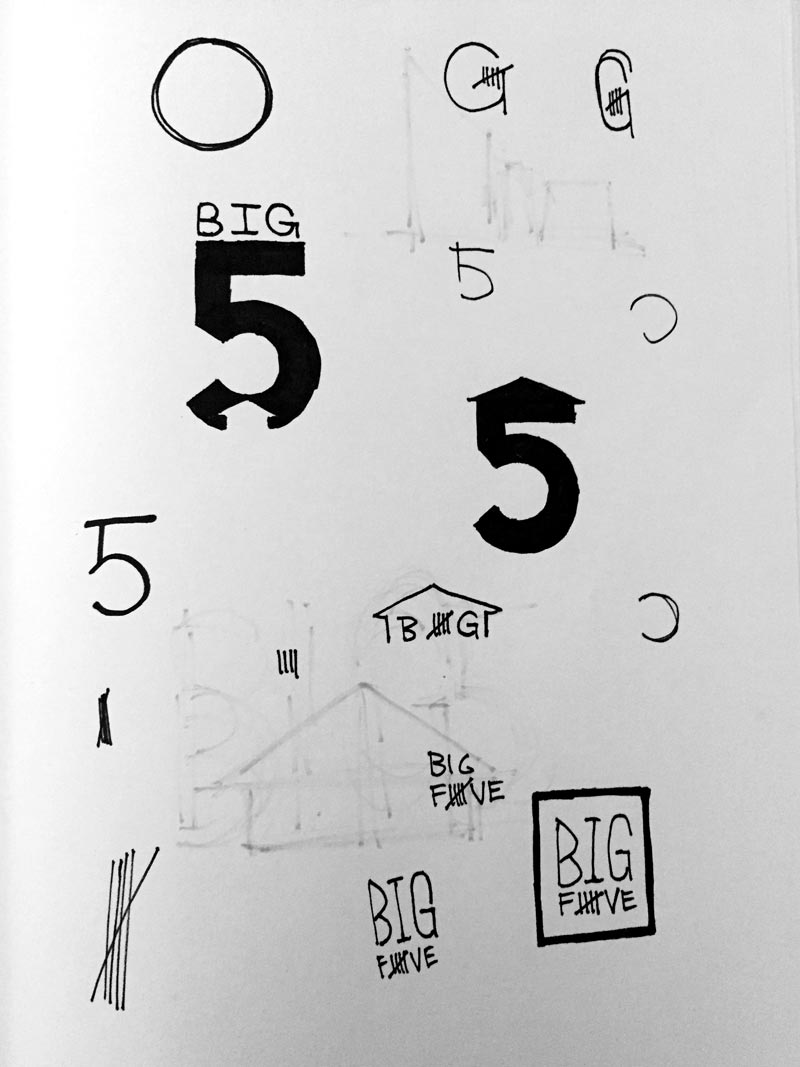
After a lot of experimenting with the serif form without much luck, the solution came with the realization that there already was a sans-serif 'g' in the number five. The secret was however that it could only be unvield from the right angle.
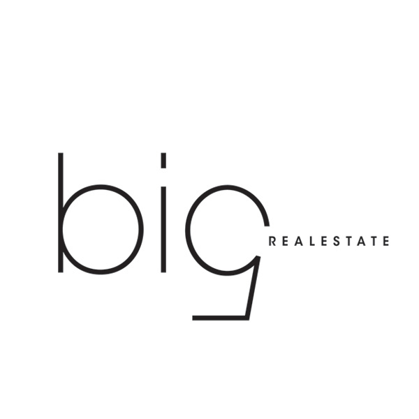
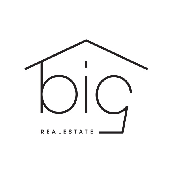
The disitinctive leaning anlge of the five provided the classy, concrete, architctural form that had been the purpose of the search all along.
Big Five Realestate is a company on the move. Creating the face of their brand has been fun and educational.