As a staple of the Stockholm nightlife for many years Solidaritet has become a well known name amongst party goers of all shapes and sizes.
In the summer of 2013 they opened up there doors to the wednesday crowd and in conjunction with this needed a new logo for their new evenings.
Their main logotype is an illustration of a vinyl record cut in half and sheard to imitate an 'S' with the type lockup resting beneath.
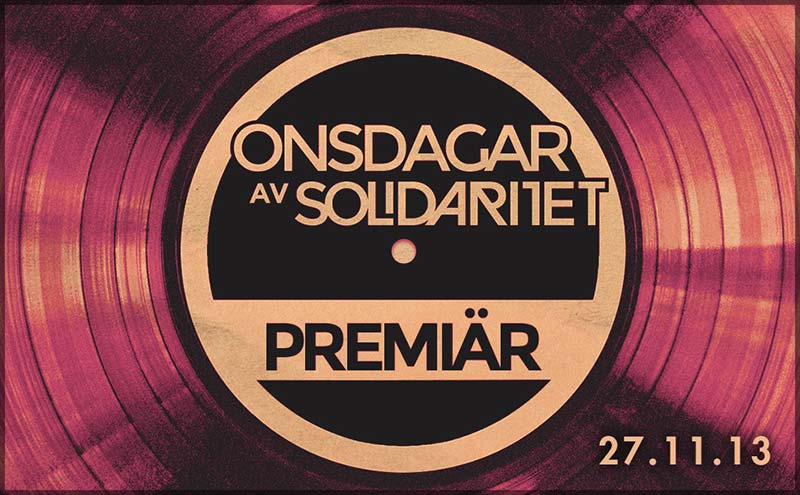
The obvious solution was to simply unite the the two halves once more, creating a circle or 'O' to represent the first letter of 'Onsdag', the swedish for wednesday. Whilst adding the word to the type lockup in the same font: Montserrat.
Further cooperation with the company resulted in a slightly more styalized logo.
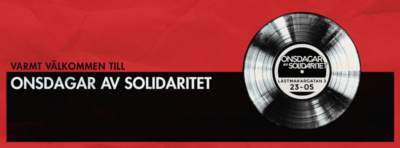
Promotional work was also made to accomodate the new evening.
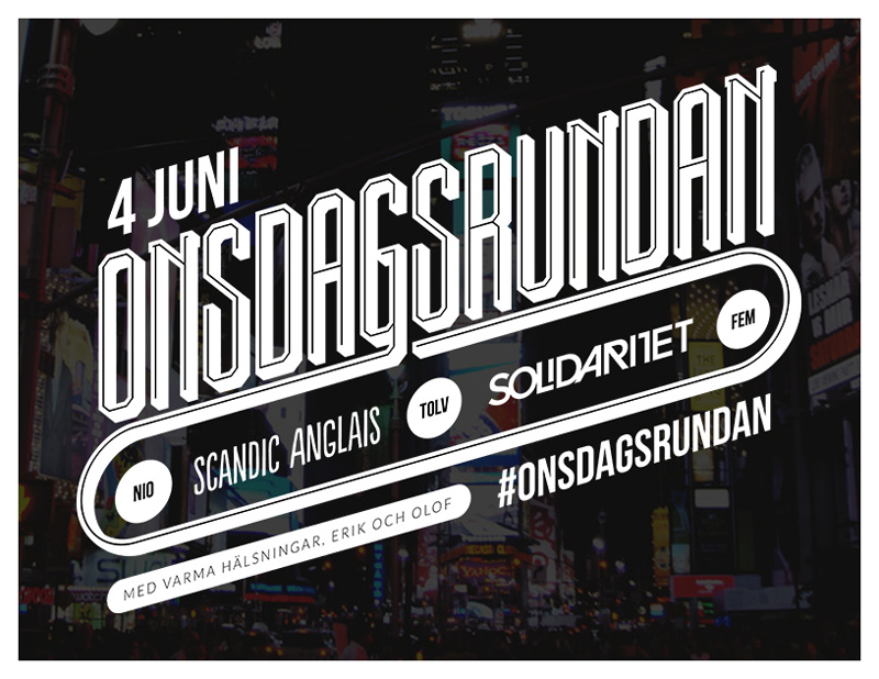
As well as material for the cooperation between Solidaritet and Scandic Anglais (now 'Jamie's Italian')
Solidaritet is a place with a lot of charm and personality. The fact that they have been at the pinnacle of this city's evening experience for so long is an achievement in and of itself.